How colour affects perception
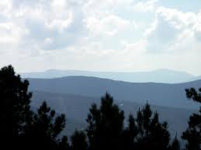
Aerial perspective describes the way the atmosphere affects the appearance of colour. Using this phenomenon can help you to create a feeling of depth or distance in your garden. When you look at objects such as trees, buildings or land features over distance, the atmosphere dulls the intensity of the colour as you look through it. This gives the appearance of paler tones on the horizon while the colour intensifies as the objects get closer to the viewer.
https://commons.wikimedia.org/wiki/User:Alvesgaspar
Leonardo da Vinci coined the term aerial perspective in his ‘Trattato Della Pittura’ – 'Treatise on Painting' in 1651. “Colours become weaker in proportion to the distance from the person who is looking at them”.
The presence of moisture and tiny particles of dust scatter the light as it passes through the atmosphere. Blue light has a short wavelength so this is scattered more, giving dark objects a bluer hue as they recede from the viewer. Red light has a longer wavelength and is scattered the least, so bright objects appear redder. This is because some of the blue light is weakened or lost from the light by which these objects are seen.
The atmosphere also affects the clarity of the image and can make distant outlines appear less distinct and they can look softened or blurred. Also, the contrast between light and dark objects becomes less pronounced as the distance increases, so light and shadow become less distinct until the contrast disappears completely.
Finally, the effects of this atmospheric interference are more noticeable at lower elevations. So, the tops of mountains can appear to be more distinct than lower land marks. This is because the air is denser the closer it is to ground level and the air is thinner at altitude.
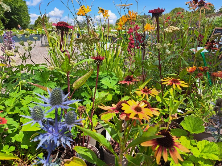
These effects have been utilised by artists since at least the 8th century and you can use them to create the impression of distance in your garden. By placing stronger more intense colours and defined shapes together you can bring the garden closer to the viewer.
By adding schemes with pale, bluey tones further back in the garden, and using soft, billowy and indistinct shapes, you will create the impression that the garden stretches further into the distance.
Our perception of colour is also affected by other factors. The greatest of these is light. The background against which colour is placed will affect the way we perceive it as well as the intensity of the light.
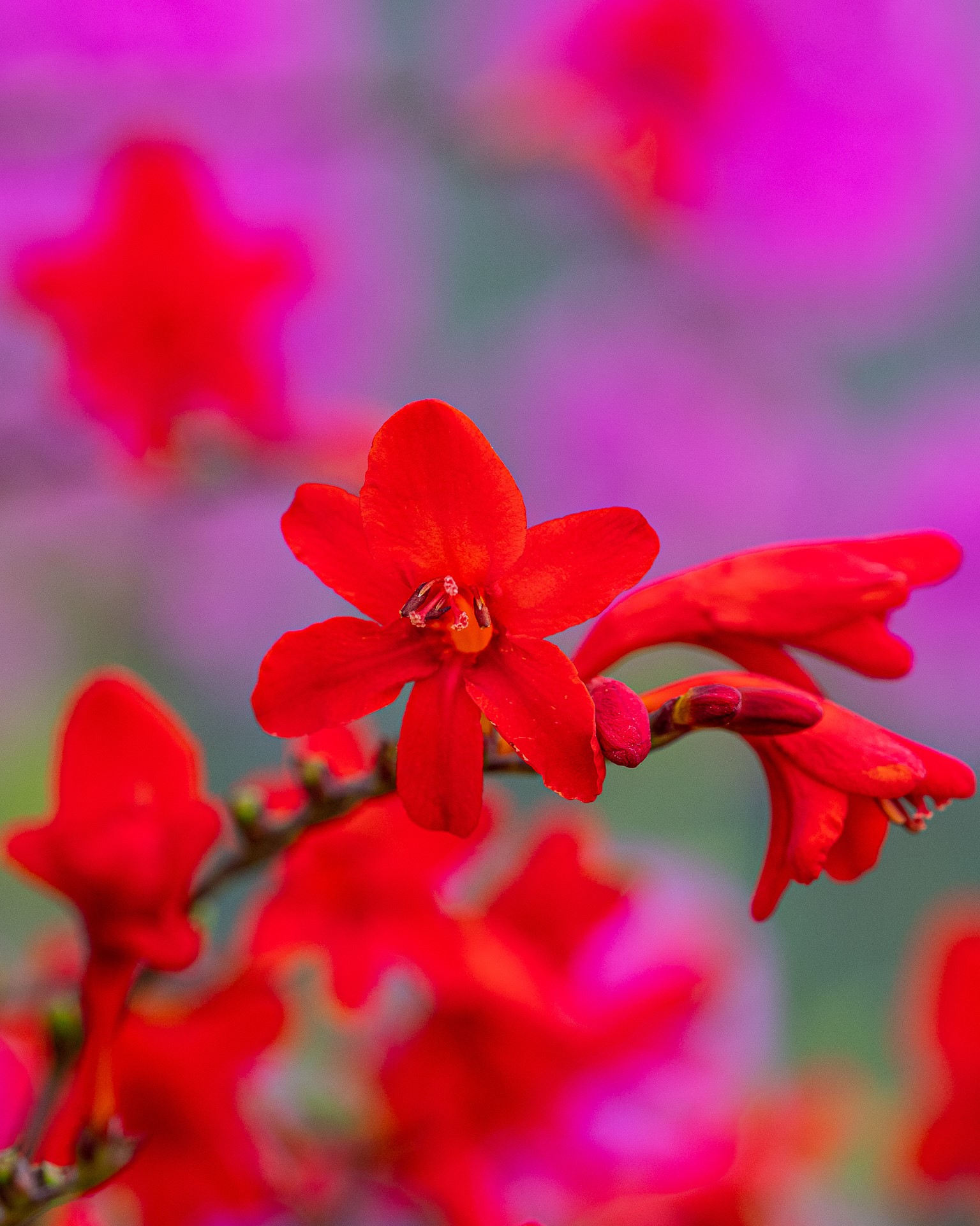
A dark background can make bright colours pop.
High altitude changes the way we perceive colour due the lower availability of oxygen.
Factors affecting colour perception.
Synesthesia is a condition whereby some people experience colours as sounds or tastes.
Our age will also affect how we perceive colour. As we age the muscles in our eyes can lose strength which can mean that as well as losing the ability to focus clearly at certain distances, we can also experience loss of sensitivity to colour. Blues are more likely to appear faded and our ability to recognise differences in hues and intensity can fade. Optical problems like cataracts and macular degeneration will have a marked effect. As a result, we may be drawn to brighter or richer colours as we age.
Some medications for heart conditions can result in yellow tinted vision and will create difficulties in telling green from blue. Medication for rheumatoid arthritis can sometimes lead to problems telling blue from green and yellow from violet.
Our mood can certainly alter our perception and depression can affect our ability to see colour. The deeper the depression the more marked the disparity can become. ‘Grey days’ can literally appear to lack colour for those affected.
Psychological responses to colour have been a source of fascination for scientists and scholars for centuries and many theories have been put forward. It is generally recognised that longer wavelength colours like red and orange elicit energetic emotional responses in the viewer and are associated with heat, appetite, passion, sexual arousal, anger and many other intense reactions. While the shorter wavelength colours of blue and green have an overall calming effect and therefore reduce excess energy in the viewer. They are perceived as cooling, calming, meditative, soothing and promote the pursuit of intellectual thoughts rather than high emotions. You can use these colours to great effect in your garden, using hot long wavelength colours in areas where you eat and entertain. Whereas cooler colours are ideal for areas where you intend to kick back, relax, mediate or read.
Finally, but most importantly each individual has a memory of colour and their reactions to these can be very telling. Some people adore yellow because it reminds them of sunshine, happiness and warmth. While others refuse to use it because to them it feels overpowering, sulphurous and acidic and can upset their equilibrium.
Admittedly strong yellows can sometimes be hard to place in a softer scheme but you may find pastel or lemon yellows more in keeping with your garden mood. Or, you could use the brighter yellows to compliment bright intense reds, oranges, purples and blues. No-one can force you to use any colour but with a little understanding you can put colour to use in subtle or strong ways to create a garden that reflects your feeling and interests.
Further information on how to use colour in your garden can be found in the articles
planting with cool colours hardy perennials planting plan for borders and gardens